
The brief
A credit union with deep roots in canyon country had outgrown a look that no longer said who it was. It needed more than a refresh: it needed a reason, written down, that every branch, ad and email could point back to.
I led the work from strategy through system, then produced a 30 page brand guide so the whole organization could hold the line without me in the room.
What I delivered
Brand foundation and positioning
Tone of voice and tagline system
Logo suite and usage rules
Color, type and photography direction
Applications, print through environment
The foundation
Four pillars, one story
Inspired by canyons: constant, and always being shaped.
01
Trust
02
Possibilities
03
Empowerment
04
Belonging
The voice
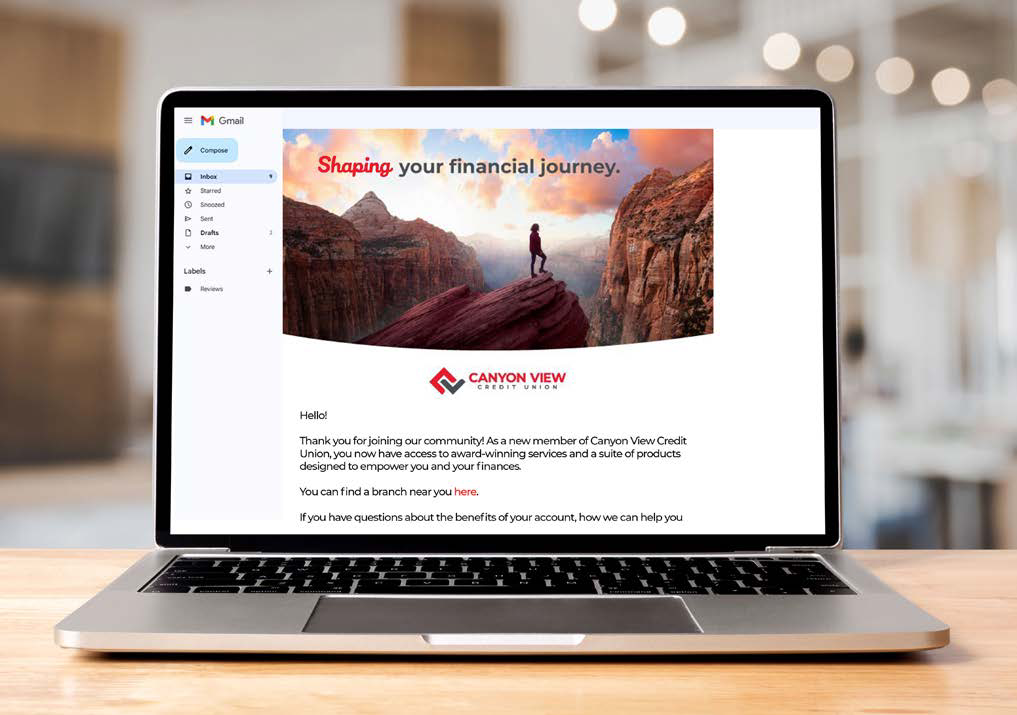
Shaping your financial journey.
One line that works on a billboard and in an email signature, plus seven supporting lines so every department had something true to say without inventing its own brand.
The system
Seven parts, one rulebook
01
Color palette
Seven colors, each with a reason drawn from Utah, specified for print and screen alike.
Berry Red
Snow White
Ash Grey
Storm Grey
Charcoal
Dark Sky
Glacier Teal
See the full palette
Primary and secondary
PMS, CMYK and RGB →
02
Brand elements
Canyon Lines: a set of ridgelines I drew by hand from the places members actually live.

See all brand elements
Salt Lake to Provo · medium · berry red
Canyon Lines and applications →
03
Secondary logos
Sub brands for programs and foundations, each drawn from the same canyon language as the parent mark.
See all secondary logos
Canyon View Giving Foundation
Eight sub brand marks →
04
Typography
Montserrat for clarity, Veronica for emphasis, with a rule about which job each one does.
Aa
MONTSERRAT
Primary
Montserrat
Seven weights, clarity first
Secondary
 Script, for emphasis only
Miller Type Foundry
Script, for emphasis only
Miller Type Foundry
Script, for emphasis only
Miller Type Foundry
See the type system
Montserrat and Veronica
Weights and character sets →
05
Photo imagery
Real people in real canyon country, shot warm and wide, so members recognize themselves.

See the photo direction
Photo direction · brand frames
Rules and selected frames →
In the wild
Print · digital · environment · swag
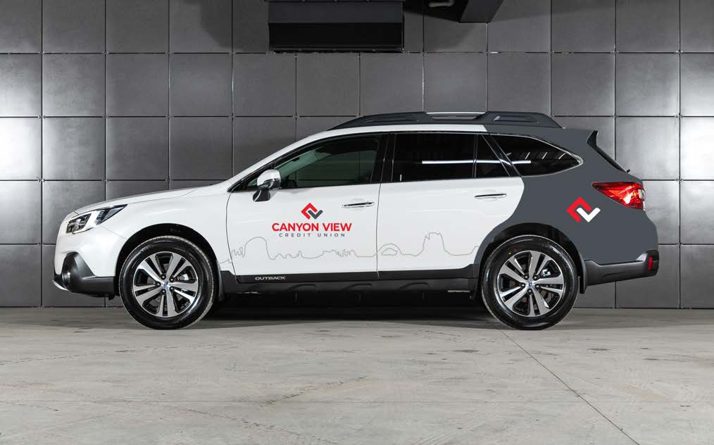
Vehicle wrap
Member email
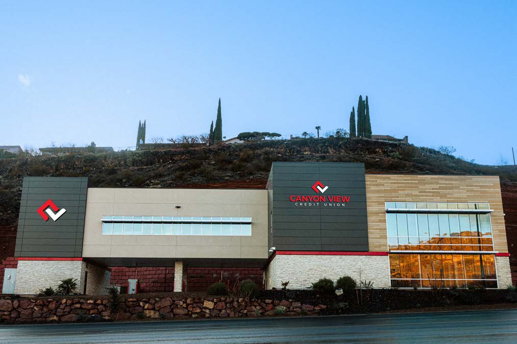
Branch environment
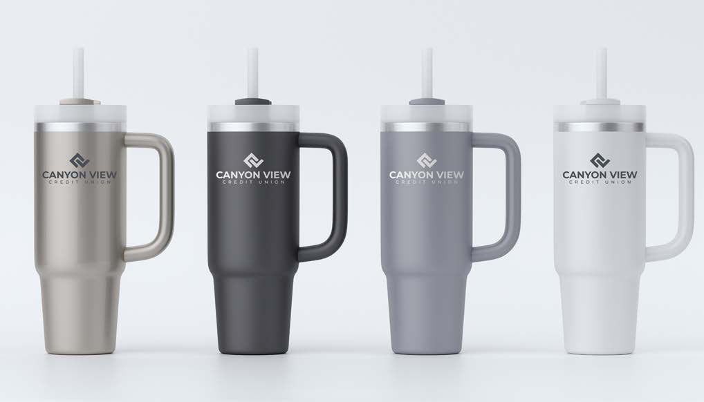
Member swag
The artifact
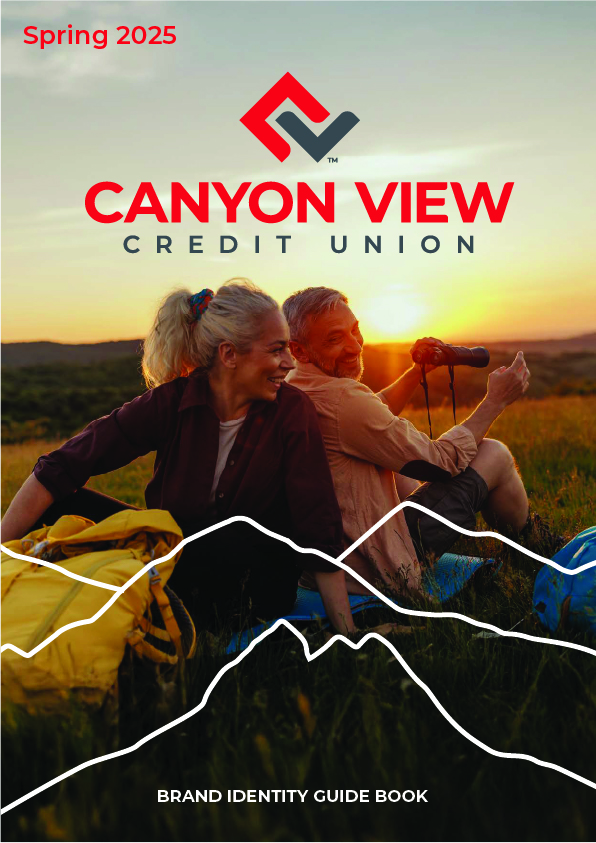
Thirty pages so the brand outlasts the launch.
Foundation, voice, identity, color, type, photography and application rules, written for the people who use it daily: tellers, marketers, vendors and printers.
See all thirty pages