Canyon View Rebrand · Typography
Two fonts, and a rule about why you use each.
Approved fonts keep every touchpoint recognizable. Unauthorized ones dilute the brand, create inconsistency and cost readability, so the guide names two faces and the job each one does.
Primary font
Clarity and professionalism
MONTSERRAT
A clean face that honors the brand legacy, sharpens recognition and reads as clear and professional wherever it lands.
Styles
Extra light
Extra light italic
Light
Light italic
Regular
Regular italic
Medium
Medium italic
Bold
Bold italic
Extra bold
Extra bold italic
Black
Black italic
ABCDEFGHIJKLMNOPQRSTUVWXYZ
abcdefghijklmnopqrstuvwxyz
1234567890!@#$%^&*()
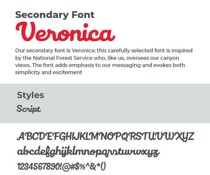
Secondary font
Veronica · Miller Type Foundry